13 Feb 19
Top 6 Web Design Trends You Can’t Ignore in 2019
As the digital space evolves rapidly, so inevitably does web design alongside it. With some trends that pay homage to reminiscent old-school charm and some to modern day minimalism, you’ve got to keep up to stay up. Having siloed out the design fads of 2018, here is our list of the strongest web design trends projected to reign over 2019 and contribute most to exceptional web design.
1. Isometric Graphics
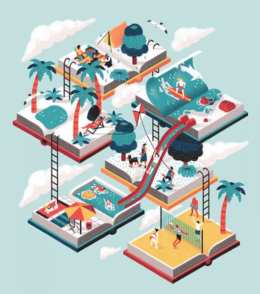
A confusing technical term for what is simply an illustration or drawing of a 3D object in 2 dimensions. Think x,y AND z in a plane. Flat 2D illustrations pale in comparison to this style, as they lack the immersive element of depth, opening a window for web users to really dive into more complex visual scenes – like the gateway opening into Narnia effect. It is no wonder why these are so highly sought after; custom-made illustrations can convert 7 times better than any stock photography. It establishes size for brands and suggests to customers that your product is a better one (leave your design rivals stuck in stock imagery quicksand).

2. Bold Typography
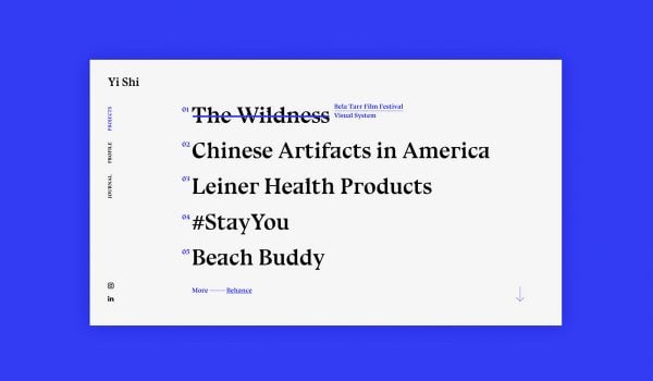
Dominating the headings and full screen navigation menus, bold sans serif typefaces and large font sizes have really taken hold. Whilst imagery and design elements remain standard generally, type is maximised for contrast to really establish visual hierarchy and give strength to the message. In an age where millennials and Gen Z have shorter attention spans and websites need to deliver the information in a more concise way, content is stripped to the bare minimum for effect.
3. Opening the grid
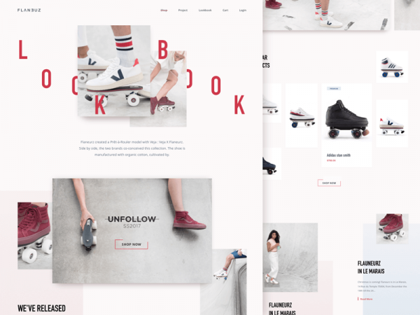
Have you noticed a trend in breaking the grid and any idea of confinement? 2019 is all about free-flowing compositions and unrestricted space. Imagine asymmetrical designs that don’t uniformly fit into the screen; think outside the box. With more free space and scrolling desired to navigate around, we can expect richer UX journeys as websites take more liberty in curating intricate UX experiences. This is perfect for the tech-savvy generation (millennials and Gen Z); wired since birth they don’t need spoon feeding.
This freedom can be further complemented with overlapping elements and disrupted text. Content styling just stepped up. Not only limited to text, this style applies harmoniously to illustrative elements and design motifs.
Richer digital experiences encourage users to engage a little deeper and longer, increasing the potential for conversion.
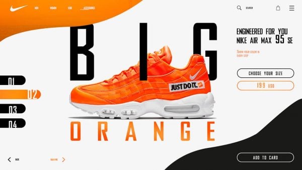
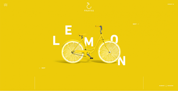
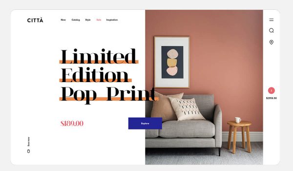
Big Shoe / Lemon Bicycle / Citta
4. Mid-century modern illustrations
Another illustrative style that will carry a lot of weight this year, these retro-style illustrations draw massive influence from the period between 1940-1960. Boasting clean lines and organic shapes, a revitalised and fresher colour palette, these retro human illustrations have been particularly popular amongst software companies. Potentially influenced by recent impactful social equality movements, and the rise in LGBQT and gender-neutral awareness , you’ll find an abundance of people in different shapes, proportions and off-kilter skin colours.
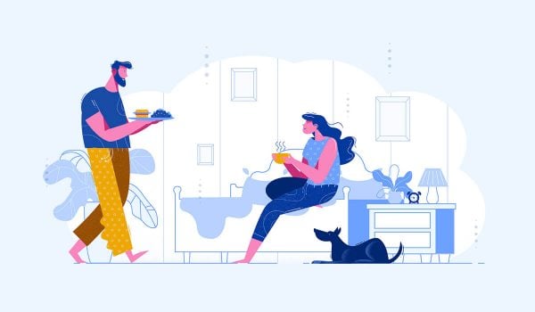
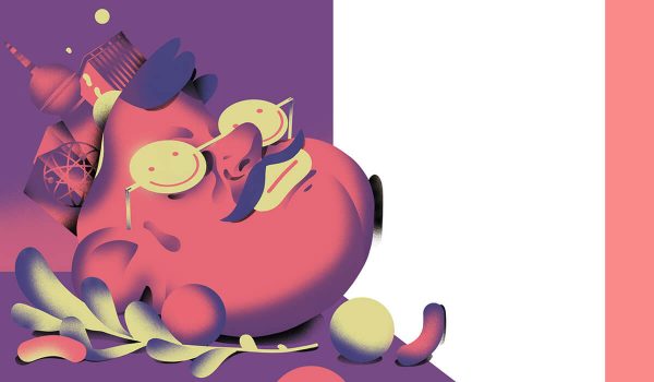
Breakfast in Bed / Pump magazine
5. Micro-interactions & animation
Those that value positive user experiences will understand the principles behind micro-interactions and animations. Although these enhancements can add dollars of investment from the developmental desk, it is a worthwhile exploit. Micro-interactions and well-crafted animations enhance the user experience as they display elegant visual cues upon receiving user activity. Similar to how more receptive sales assistant can enhance your shopping experience, these interactions add excitement and will instantly elevate even average design layouts. However the key is subtlety; you want the sales assistant to acknowledge you but not overwhelm you. Micro-interactions polish up your design and facilitate a more engaging user journey.
6. Vibrant Colours & Subtle Transitions
Taking the web design space by storm and most recognisably in digital giants Apple advertisements and Spotify album covers, this colour treatment will continue to be the frontrunner for futuristic modern design. With a spectrum of choice neon colours to pick from, the vibrant colour gradients are characteristically soft and subtle (also known as colour transitions). This subtlety differentiates it strongly from the cheaper-looking gradients used back in the 90s. Traditional photography is revitalised with enhanced depth and unifies better on the page, as colour schemes through imagery are aligned to branding colours.
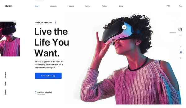
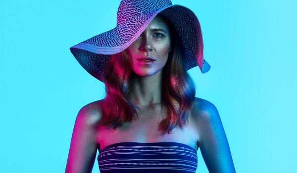
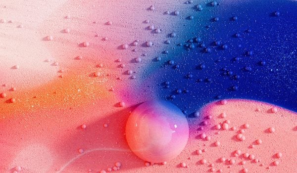
Minimi / Queensland Theatre / Anxia
How can we help
We hope you enjoyed our web design forecast. As digital innovators, we are excited to explore these trends across all our projects. Give us a call us today if you’d like to chat. We offer digital consultancy, website design and can workshop innovative web solutions for your business as well. Stay tuned for more industry news.

